


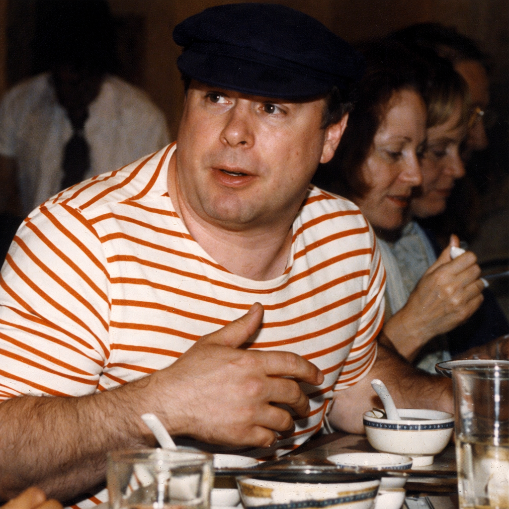
I have a lot of photos that have never seen the light of day, and I’m processing them now. Some are going to need slight restoration, most won’t, but could stand colorization to make them easier to see (read).
Minimal Improvements: On Restoring Without Rewriting
I’ve been spending time with old photographs lately — images that were scanned long ago, usually in black and white, and then left alone. Not abandoned exactly. More like placed on a shelf where only time can see them.
These aren’t “art projects” in the contemporary sense. There’s no impulse to update them, stylize them, or bring them into fashion. The work, if it can be called that, is quieter.
The guiding idea is simple:
restore without changing.
Many photographs are black and white for reasons that have nothing to do with aesthetics. Film stock, cost, availability, urgency, or sheer circumstance dictated the format. Color existed in the world at the moment the shutter clicked, even if the chemistry couldn’t hold it.
When color is returned carefully, it doesn’t add novelty. It removes a layer of distance.
The danger, of course, is interference.
Too much clarity turns memory into illustration.
Too much saturation turns people into props.
Too much “fixing” erases the conditions that made the photograph honest in the first place.
So restraint becomes the discipline.
No attempt is made to correct blur that belongs to the moment.
No effort to sharpen what the lens didn’t see.
No beautification, no smoothing, no cosmetic revisionism.
The grain stays.
The softness stays.
The mistakes stay.
Color, when it’s used at all, is treated as a background condition — like weather. Skin tones are allowed to be uneven. Shadows are allowed to remain uncertain. Clothing is allowed to be dull. Walls are allowed to be walls.
The goal is not accuracy in the forensic sense. It’s plausibility in the human sense.
What happens when this is done carefully is something subtle but unmistakable. The photograph stops announcing itself as “the past.” The people in it don’t feel historical. They feel paused.
Color doesn’t modernize them.
It releases them.
There’s a difference between restoration and completion. Restoration tries to return an object to a known state. Completion simply allows it to finish speaking.
In that sense, minimal improvement isn’t really improvement at all. It’s a courtesy. An act of listening long enough to know when to stop touching the image.
The most surprising thing is how little is needed. Often a single shift — a suggestion of warmth in skin, a neutral tone in a wall, a hint of daylight — is enough to collapse the distance between then and now.
Anything more feels like interruption.
I’ve come to think that photographs don’t want to be perfected. They want to be left intact, but awake.
Sometimes the best restoration is not fixing what’s broken, but returning what went missing and stepping out of the way.
That’s the practice.
Minimal improvement.
Maximum respect.
===========================================================================
On the surface, restoring old photographs and producing fake magazine covers to promote a digital superstar can look like opposites, or even contradictions. One appears conservative and backward-looking. The other looks speculative, forward-facing, even playful. But underneath, they’re actually the same practice operating at different ends of time.
Minimal color restoration looks backward. It returns presence to something that already happened. Fake magazine covers, posters, publicity shots, and staged ephemera look forward. They create presence for something that has not yet fully happened. In both cases, the task is identical: to make something feel real enough to be lived with.
Neither activity falsifies facts. What’s being worked on is context.
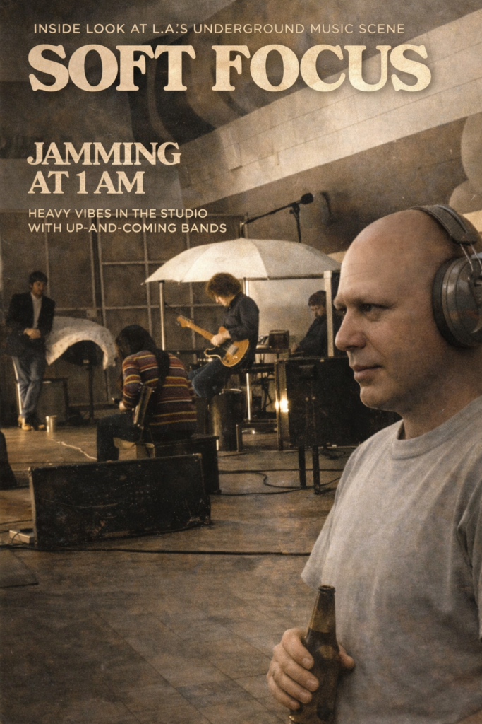
A magazine cover is not reality. A press photo is not reality. A backstage shot is not reality. These are interfaces. They tell the viewer how to relate to a person, a group, or a phenomenon. When a digital band or superstar appears on a fabricated magazine cover, the claim isn’t “this literally happened.” The claim is “this is how this entity exists within a cultural grammar you already understand.”
That’s the same move that careful colorization makes. It says: this moment belongs in the same sensory world as you. It doesn’t elevate it. It doesn’t modernize it. It removes unnecessary distance.
The ethical boundary in both directions is restraint. In restoration, restraint means not beautifying, not sharpening what wasn’t sharp, not correcting blur that belongs to the moment. In fabrication, restraint means not exaggerating success, not simulating achievements that contradict the persona, not inflating importance beyond plausibility.
The fake covers work because they are plausible, not spectacular. They feel like artifacts that could have existed quietly alongside everything else. That’s why they don’t read as scams or satire. They read as documentation from a slightly adjacent timeline.
What’s being invented is not the person or the group. The digital superstar already exists as a voice, a sound, a style, a coherent personality. What’s being created is the paper trail that any cultural entity eventually accumulates: press, photographs, ephemera, the material people remember things by.
That impulse is identical to restoring a photograph. In both cases, you’re providing the supporting material that would naturally have existed if circumstances had been slightly different.
This matters now because we’re entering a period where digital entities will exist before institutions recognize them, where documentation will precede consensus, and where archives will be assembled in advance of history. Working with familiar forms isn’t futuristic at all. It’s conservative in the best sense. It respects grammar. It respects expectation. It doesn’t shout “new.” It says, quietly, this belongs here. You already know how to read it.
Whether returning color to an old photograph or creating a magazine cover for a digital band, the aim is the same: restore context without rewriting reality.
That’s the throughline.
===========================================================================
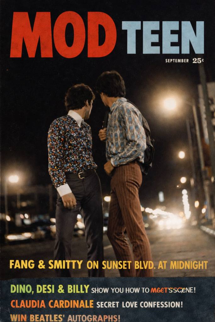
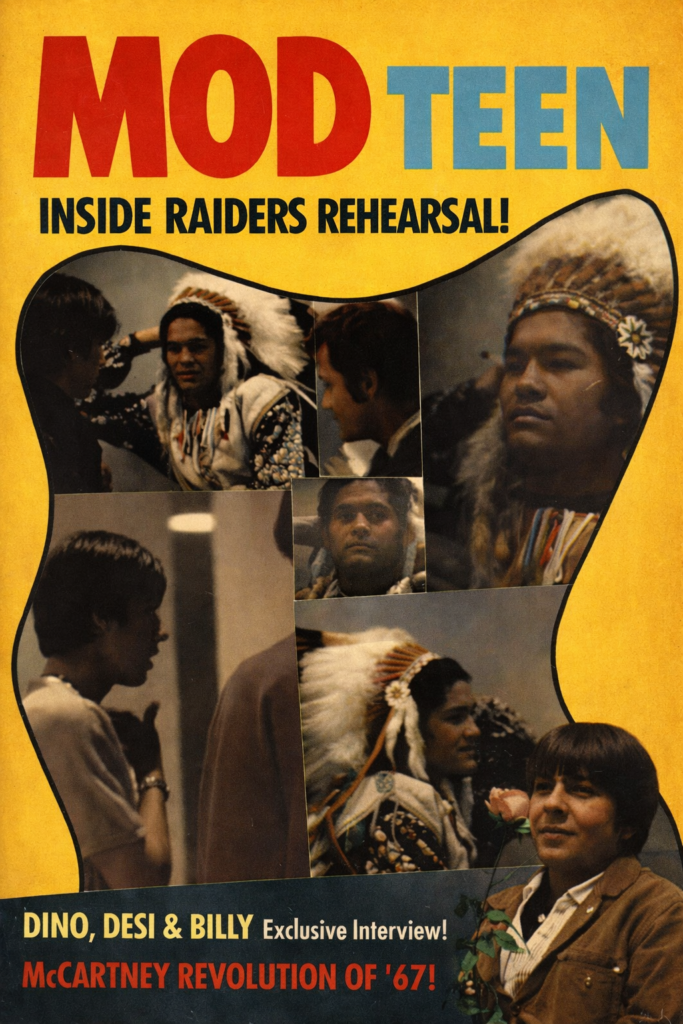
I was the editor of MOD Teen Magazine 1967 & 68, and at the same time wrote articles for Chuck at Tiger Beat and MONKEE Spectacular at 25 cents a word, plus black & white and color photography for the magazine and the model agency.
There’s a quiet difference between restoration and invention, and it matters more than people realize.
Lately I’ve been working with old photographs that were originally shot on black-and-white film, later scanned, sometimes poorly, sometimes lovingly, sometimes with damage baked in by time. The temptation with modern tools is always to “improve” them—to sharpen aggressively, clean too much grain, smooth skin that never asked to be smooth, invent detail that was never there. That impulse changes the photograph. It turns memory into illustration.
The thing is, these old blurry photos when colorized show a lot more detail.
What I’m interested in instead is minimal return. Not enhancement, not reinterpretation, but restoration in the strict sense: returning something closer to how it might have been experienced when it was first made. Colorization, done carefully, can serve that goal. Not as fantasy color, not as fashion color, but as atmospheric color—skin tones that feel plausible, fabrics that sit quietly, light that behaves the way light behaves.
Most of the photos I’m working with already have a strong internal logic. The lighting is real. The grain is real. The blur is real. The shadows are earned. When color is added lightly, without trying to impress anyone, the image doesn’t become “modern.” It becomes oddly present. Less like a reconstruction and more like a remembered moment that suddenly exhales.
What surprised me is how many people respond to that restraint. They don’t say “wow, look what AI can do.” They say things like, “That feels like I remember it,” even if they were never there. That’s a very different reaction. It suggests that the value isn’t novelty—it’s continuity.
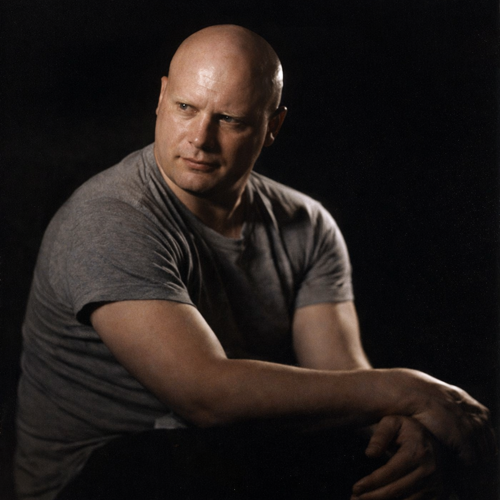
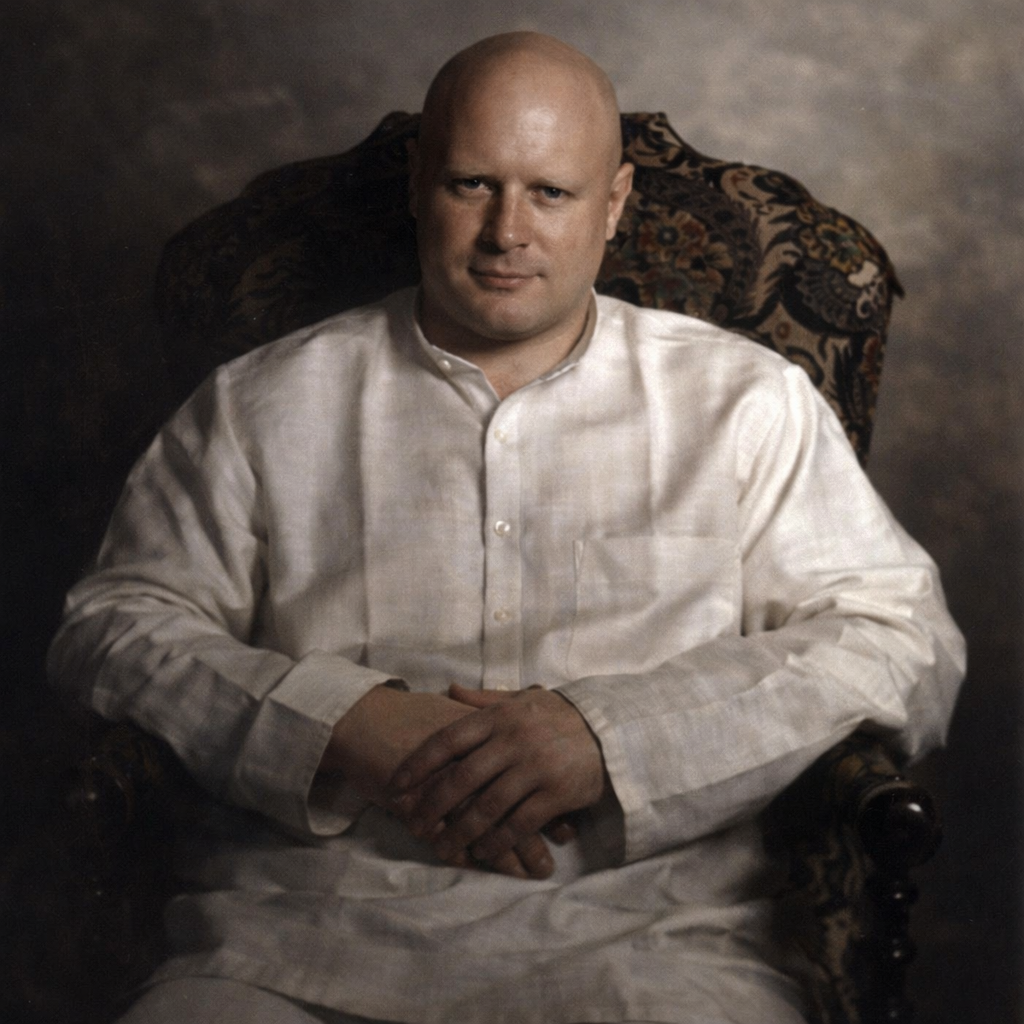
This connects directly to another thing I’ve been doing: the deliberate creation of fictional artifacts around digital musicians, digital bands, and digital personas. Magazine covers, promotional photos, liner notes, publicity stills—objects that look like they belong to a cultural moment, even if that moment never technically happened.
At first glance, those two activities seem opposed. One is about preserving truth. The other is about inventing narrative. But the bridge between them is tone. In both cases, the goal is not to shout “this is new” or “this is fake.” The goal is to let the artifact sit calmly in the visual language of its world.
When a fake magazine cover is done well, it doesn’t announce itself as satire or trickery. It behaves. It uses the grammar of real magazines: composition, hierarchy, restraint, confidence. In the same way, a carefully colorized photograph doesn’t announce itself as a technological achievement. It simply resumes breathing.
Both practices depend on the same discipline: knowing when to stop. Knowing when not to add drama. Knowing that credibility comes from understatement.
There’s also a cultural shift happening underneath all this. We’re moving away from a world where images are assumed to be documents and into a world where images are assumed to be constructed. In that environment, paradoxically, restraint becomes more trustworthy than perfection. Grain feels honest. Blur feels human. Slight imbalance feels real.
I suspect a lot of people would welcome the chance to revisit their own black-and-white archives this way. Not to modernize them. Not to stylize them. Just to let them quietly re-enter the present with a little color, the way memory does—not all at once, not perfectly, but gently.
In that sense, restoration and invention aren’t opposites at all. They’re both ways of practicing respect for form. Whether you’re bringing an old photograph back toward life or giving a digital persona a believable cultural footprint, the real work is the same: listening to what the image wants to be, and then doing slightly less than you could.
That’s where the magic seems to live.
===========================================================================
Hey, look! Here’s the Bardo bus!
===========================================================================
See You At The Top!!!
gorby